Building a competitive analysis UX framework is the most strategic way to evaluate other products and ensure you don’t design in a vacuum. It’s a systematic process of identifying competitors and evaluating their products to find strengths, weaknesses, and opportunities. This guide provides a practical, step-by-step framework for conducting a UX competitive analysis that will give you actionable insights for your next project.
Key Takeaways: A Framework for Success
-
Go Beyond Features: A great UX analysis evaluates entire user journeys, not just feature lists.
-
Visuals are Key: Capturing high-fidelity screenshots of competitor flows is essential for a meaningful audit.
-
Structure is Everything: Use a consistent framework or template to make your findings objective and easy to compare.
-
The Goal is Action: Your analysis should always end with a clear set of actionable recommendations for your own product.
Why Competitive Analysis is a Non-Negotiable Step
Skipping this step is like trying to navigate a new city without a map. Investing a few hours in a proper UX analysis is a high-leverage activity that helps you:
-
Understand Established User Expectations: It reveals the common design patterns and conventions in your industry. As the experts at the Nielsen Norman Group have noted, understanding these conventions is key to creating an intuitive experience.
-
Identify Strategic Opportunities: By finding gaps or areas of user frustration in a competitor’s product, you can discover clear opportunities for your own product to excel. A competitor’s weakness can become your key differentiator.
-
Avoid Reinventing the Wheel: Why guess at the best way to design a checkout flow or an onboarding sequence? You can learn from a dozen examples that are already live and have been tested on thousands of users. This saves immense time and reduces risk.
-
Gain Stakeholder Buy-In: Presenting data-backed evidence of what competitors are doing is a powerful way to justify your design decisions. It moves the conversation from “I think we should do this” to “The industry standard is X, but we have an opportunity to do Y, which is better because…”
The 4-Step Framework We Use at Figscreen
At Figscreen, we use a variation of this 4-step framework every quarter to stay ahead of the curve. It’s designed to be practical, repeatable, and focused on actionable outcomes.
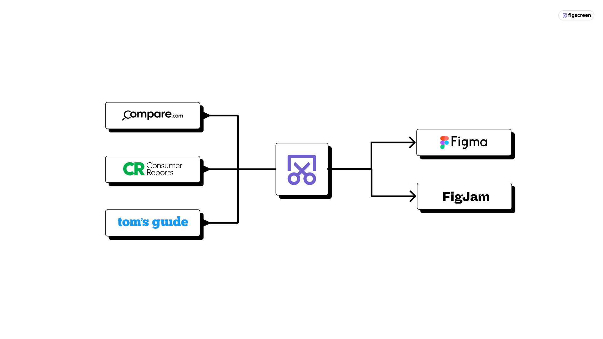
Step 1: Identify Your Competitors (Direct vs. Indirect)
First, create a list of who you’re up against. It’s crucial to separate them into two groups to understand the full landscape.
-
Direct Competitors: Companies offering the same solution to your target audience. You can find these with a simple Google search for your primary product category (e.g., “Figma screenshot plugin”).
-
Indirect Competitors: Companies solving the same core user problem but with a different solution or for a different audience. For Figscreen, this might be a generic screen capture tool that doesn’t integrate with Figma. These are important because they can reveal broader user behaviors and pain points.
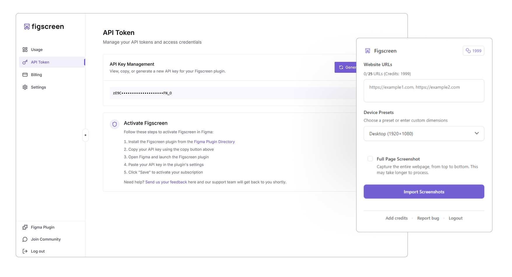
Step 2: Capture the Visual Intelligence (The Figscreen Method)
This is where most workflows slow down. The goal is to gather high-fidelity visuals of the key user flows you defined in Step 1. You need to see exactly what a user sees. Manually taking, organizing, and stitching together dozens of screenshots is a workflow killer.
This is the perfect moment to use Figscreen. Open our Figma Screenshot Plugin and simply enter the URLs of your competitors’ key pages. In seconds, you’ll have pixel-perfect, full-page screenshots of their entire user flow right inside your Figma or FigJam file. This allows you to assemble a complete visual audit, creating a powerful “war room” for your analysis.

Step 3: Analyze Your Data with a Reusable Framework Template
With your visual data collected, it’s time for analysis. The key is to evaluate each competitor against the same set of criteria. This turns subjective opinions into objective data.
Here is a simple, effective template you can build in Figma, Notion, or a spreadsheet to create your own reusable framework.
| Feature / Heuristic | Competitor A | Competitor B | Competitor C | Our Opportunity |
| First Impression/Clarity | Good | Confusing | Excellent | Be clearer than B. |
| Visual Design | Dated | Modern | Minimalist | Adopt a modern feel. |
| Primary CTA | Weak | Strong | Strong | Make ours stand out. |
| Navigation | Complex | Simple | Simple | Keep it simple. |
| Pricing Page Clarity | Good | Hidden | Excellent | Be transparent. |
| Onboarding Flow | 3 steps | 6 steps | 4 steps | Simplify to 2 steps. |
Pro-Tip: Once your screenshots are in Figma, you can easily crop a shape to isolate specific UI elements—like navigation bars or pricing tables—for an even more detailed, side-by-side comparison.
Step 4: From Insights to Action: Turning Your Framework into a Product Roadmap
The final and most important step is to turn your raw data into a concise, actionable summary. A simple SWOT analysis (Strengths, Weaknesses, Opportunities, Threats) is a perfect format.

-
Strengths: What are we doing better than everyone else?
-
Weaknesses: Where are we lagging behind the competition?
-
Opportunities: What market gaps or competitor flaws can we exploit?
-
Threats: What are our competitors doing that could put us at a disadvantage?
This summary should conclude with 2-3 concrete, actionable recommendations that will directly influence your product roadmap and design strategy. For example, an insight like “Competitor B’s onboarding is confusing and has 6 steps” can lead directly to a product goal: “Develop a new 2-step onboarding flow that is best-in-class for simplicity.”
Common Mistakes to Avoid in Your Analysis
-
Focusing Only on Features: Don’t just make a list of features. Analyze the entire user journey and the experience of using the product.
-
Only Looking at Direct Competitors: Indirect competitors often reveal innovative solutions to the same core problem.
-
Forgetting the “Why”: For every observation, ask “why?” Why did they design it this way? What user problem were they trying to solve?
-
Creating a Report That No One Reads: Your output should be a short, visual, and highly scannable summary. The detailed spreadsheet is for you; the synthesized action plan is for the team.
By following this structured approach, you can transform a vague research task into a source of clear, strategic insights that will make your product—and your design process—better.
Need accurate visual references of a live site for a redesign or component audit?
Figscreen eliminates the hassle of capturing web pages so you can focus on building.
Figscreen’s plugin integrates directly into Figma, allowing you to pull pixel-perfect images of any website for visual testing, documentation, or design hand-offs, all without leaving your design tool.
Get the visual context you need in seconds — install the Figscreen plugin today.